Quick Navigation configuration
- Approach & Process -
- Empathize -
The majority of the feedback based around the pain points had been collected over a course of time from various areas such as: site visits, customer service boards (PERS) and design partner meetings. The personas for this product fit two primary groups: the Administrators (who could be the owners or managers) and the Customer Service Representatives (CSRs).
- Define -
Challenge: Unfortunately, the default templates provided by Vertafore's My Agency Home are not a 100% match to the processes agencies are supposed to follow and they are not editable. Additionally, each insurance agency differs on how they do their workflows. This lack of customization results in a lot of problems for the CSRs such as needing to work steps out of order for some templates or keeping track of exceptions for a specific carrier on others.
Goal: Revamp Quick Navigation Configuration to allow for customization so Administrators can tailor all aspects of the templates to match workflows specific to their agencies. The system must be simple, easy to use but also provide powerful modification options.
Hypothesis: If the configuration options for Quick Navigation Configuration were expanded to include the following options, they would even more closely match agency processes and Platform adoption would increase.
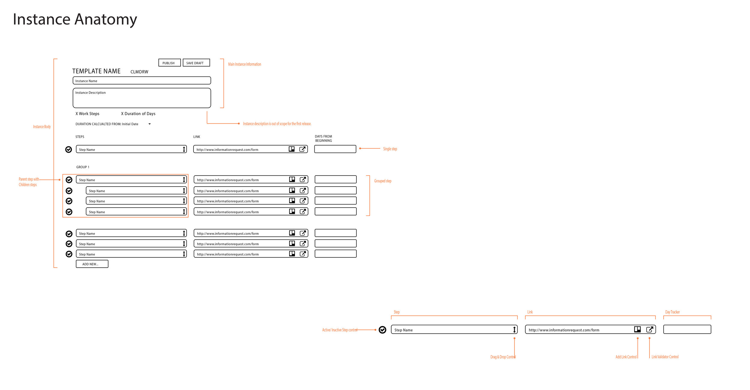
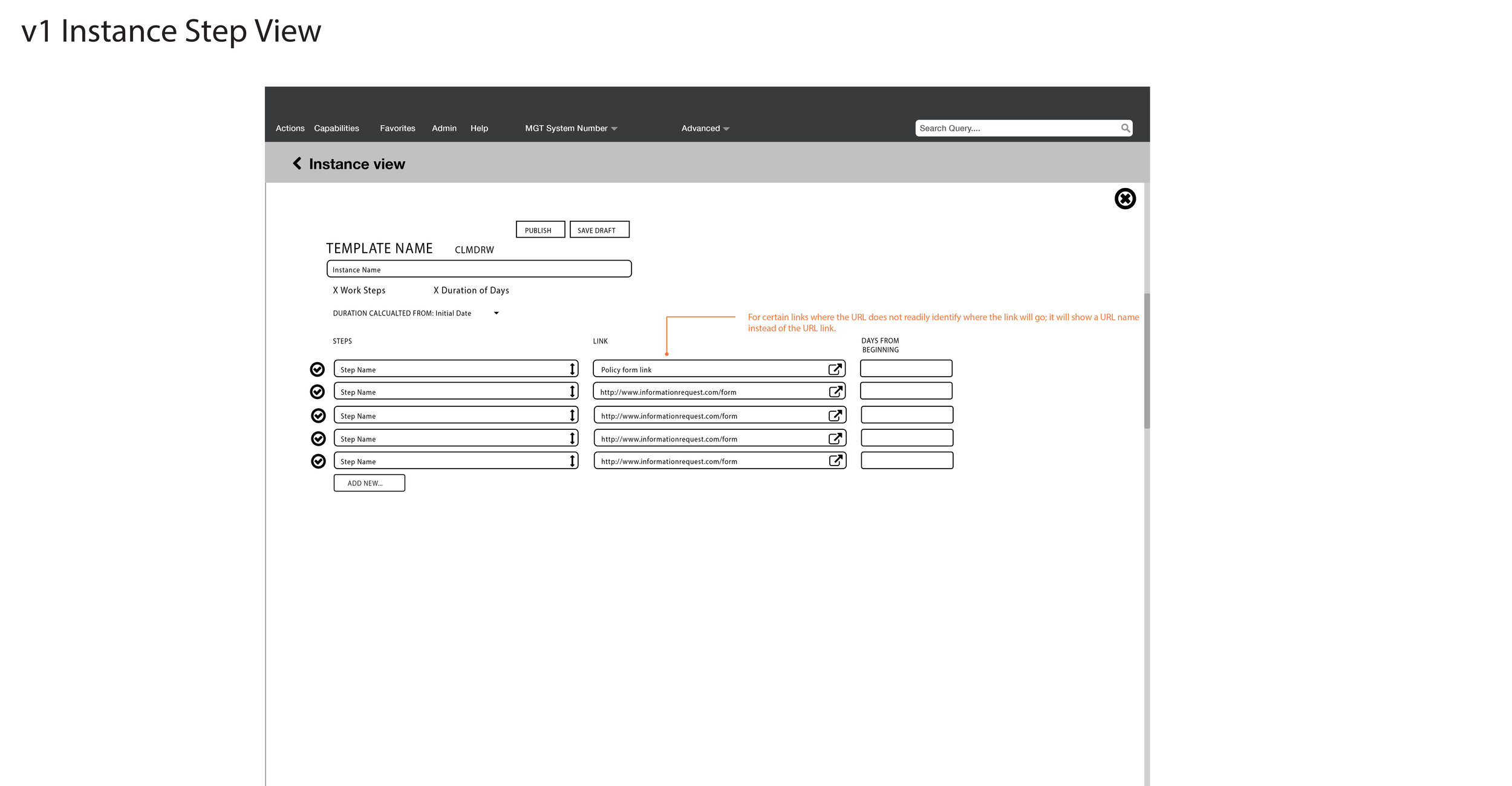
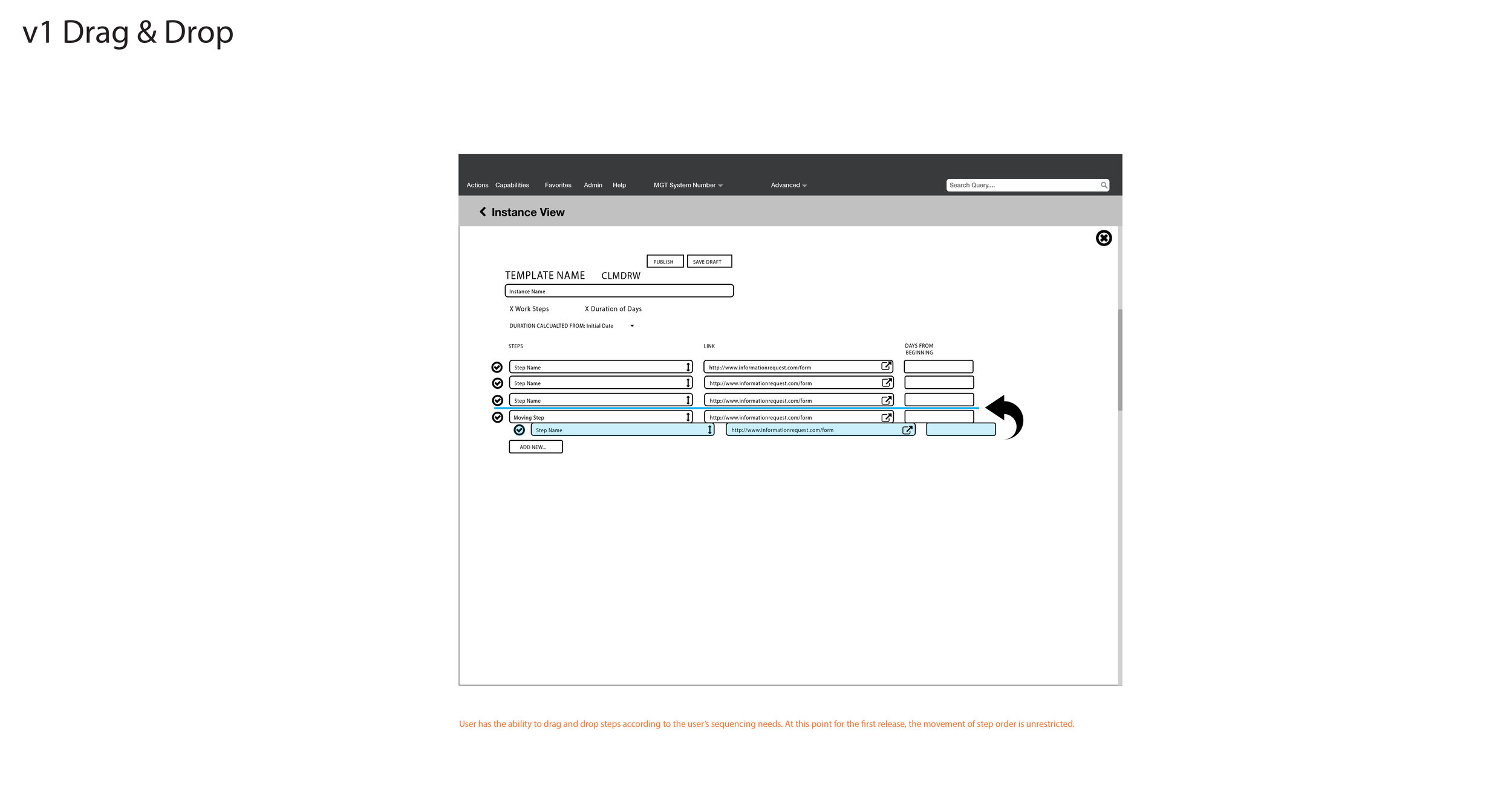
- Sort order steps
- Adding simple steps
- Change starting point for due date calculation
- Maintain multiple instances of the same template
- Add Comment/Description to a Quick Navigation Configuration instance (aka copy)
- Ideate -
Concept
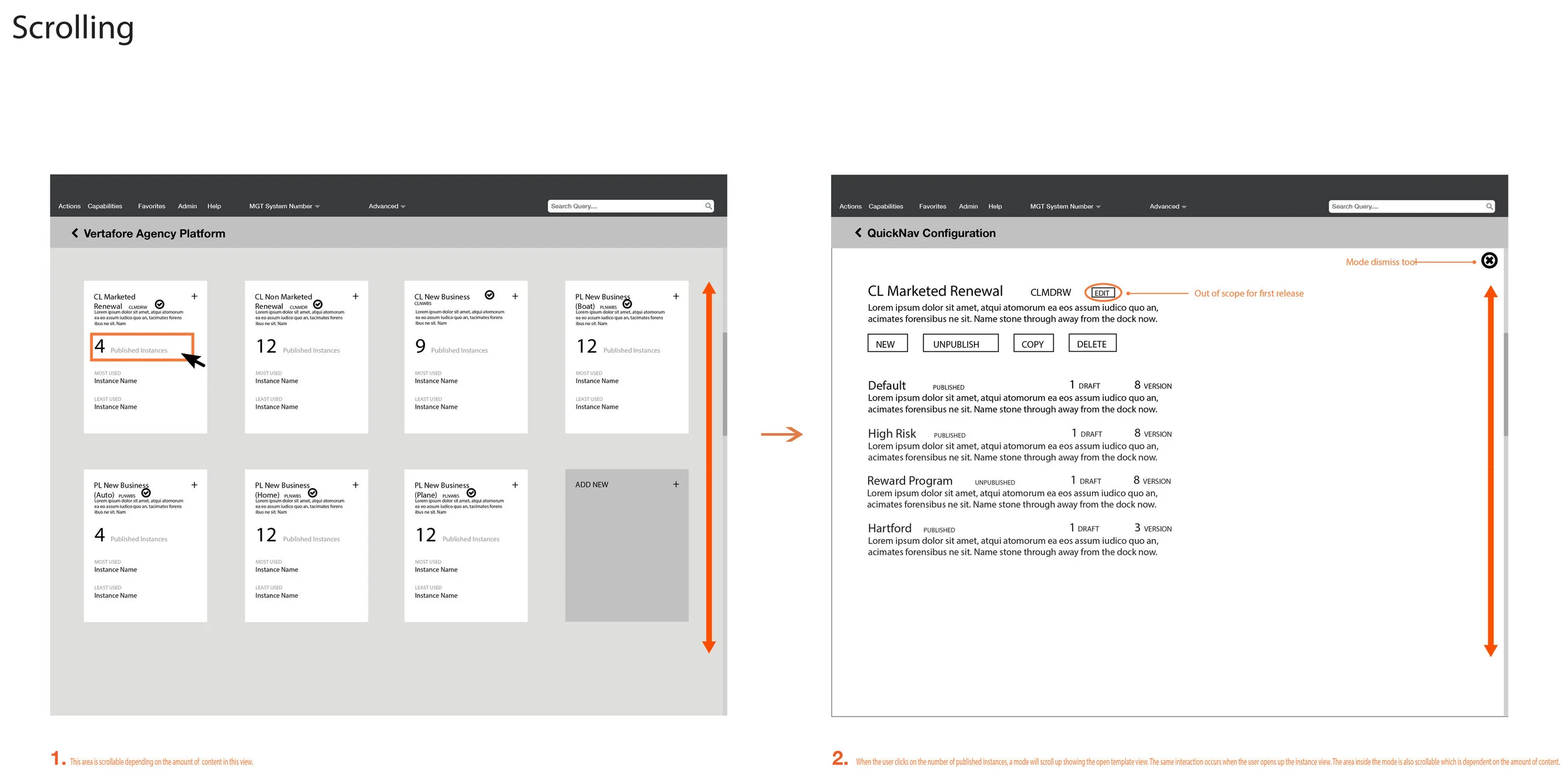
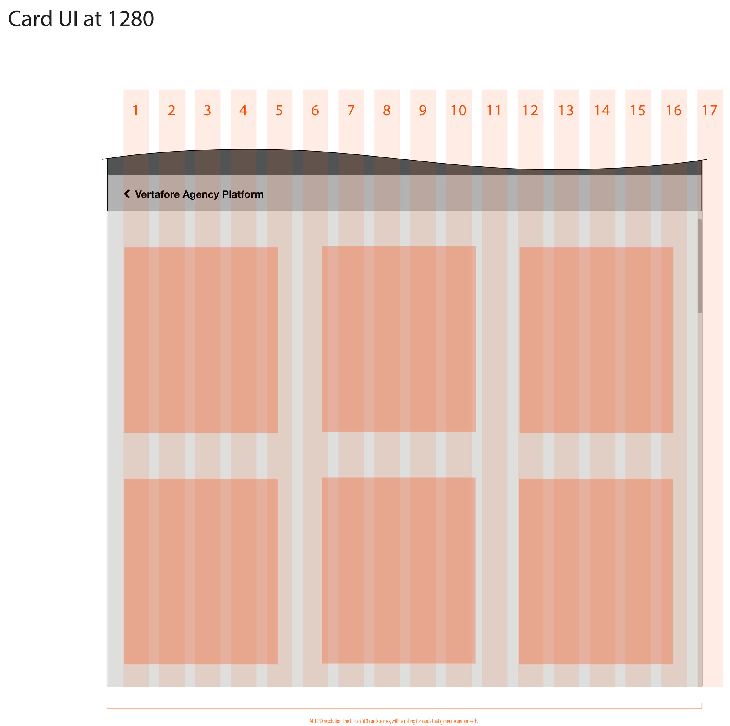
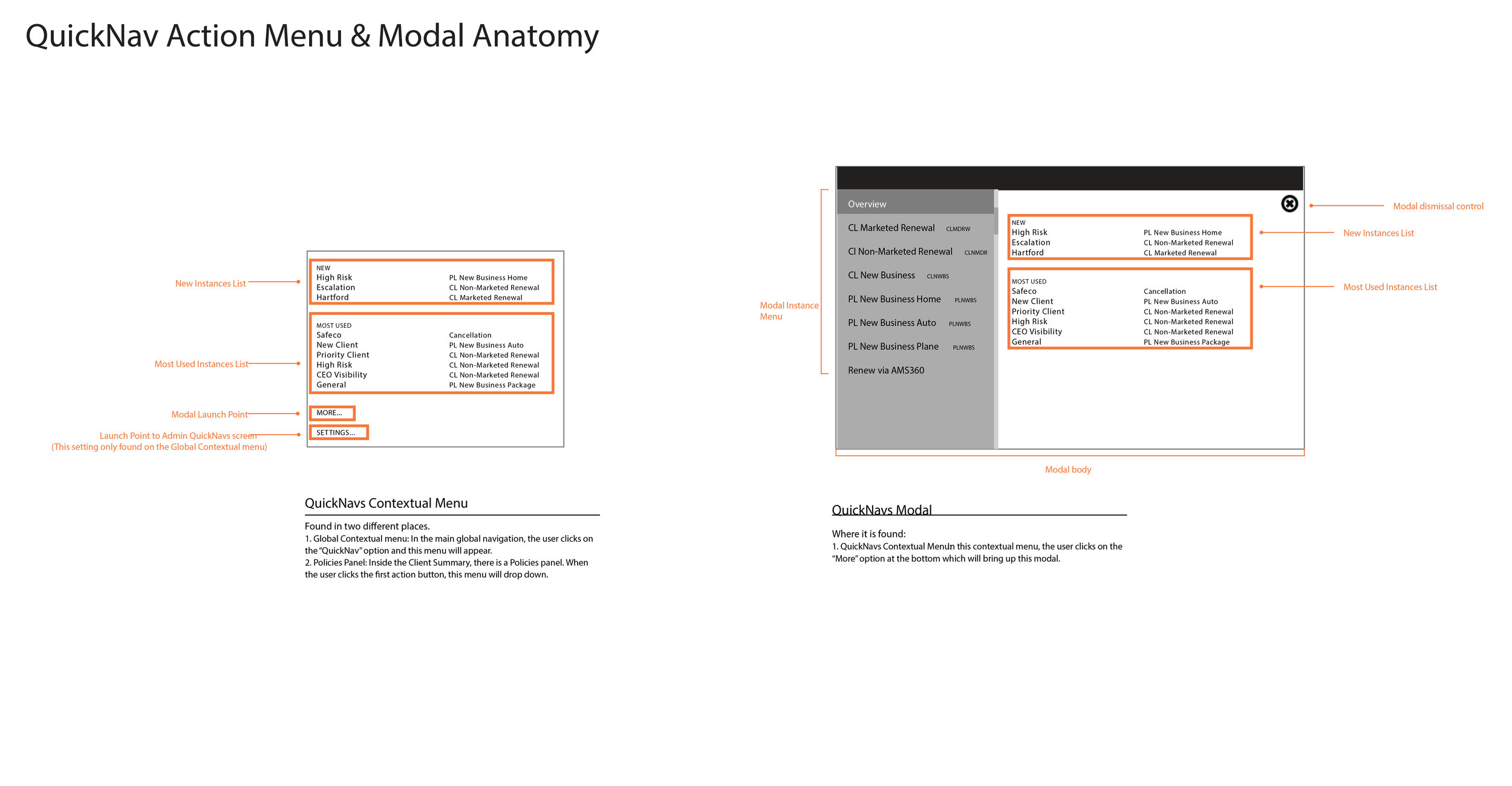
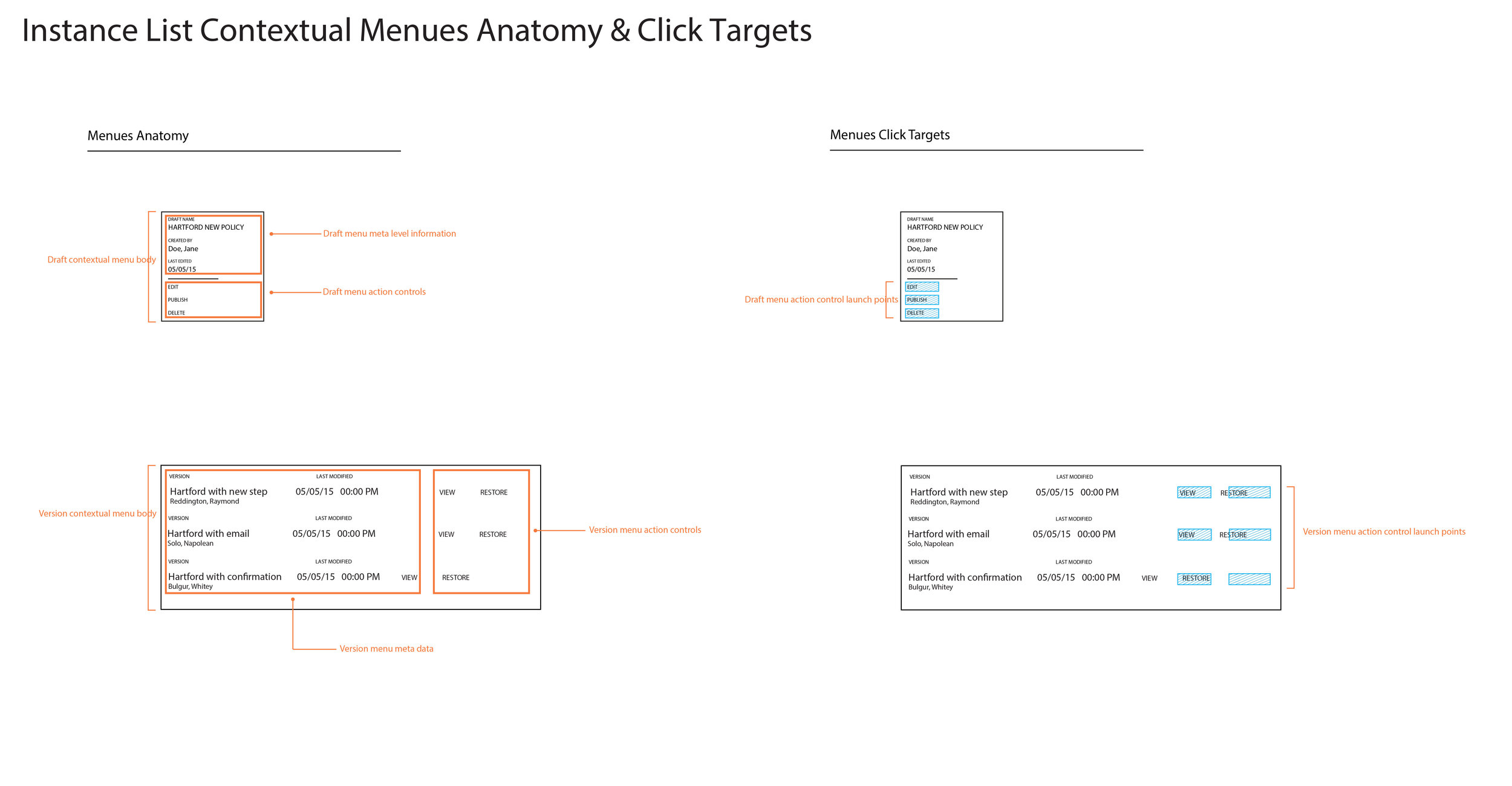
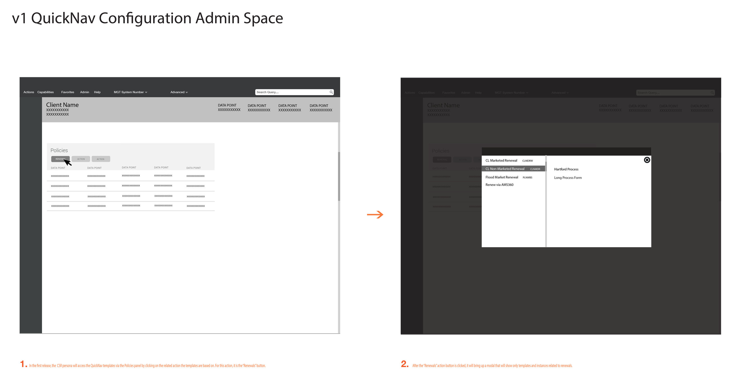
My team mate did a reimagining of the current system basing it on a card interface for the main template page where the user would navigate from the main page to the instance page, step configuration page and back to the main page in the first row. The second row shows two different areas where the CSR can access the new Quick Navigation Configuration workflows from the dashboard.
- Prototype & Test -
Mental Model Test
Taking the concepts, I created several Axure prototypes to test the mental models of our design partner group to see if they understood the general concepts behind the new design. The test covered four different areas:
- Overall Arc: The process of going from the main page, instance page, step configuration page and back to the main page
- Adding a template
- Disabling and deleting a template
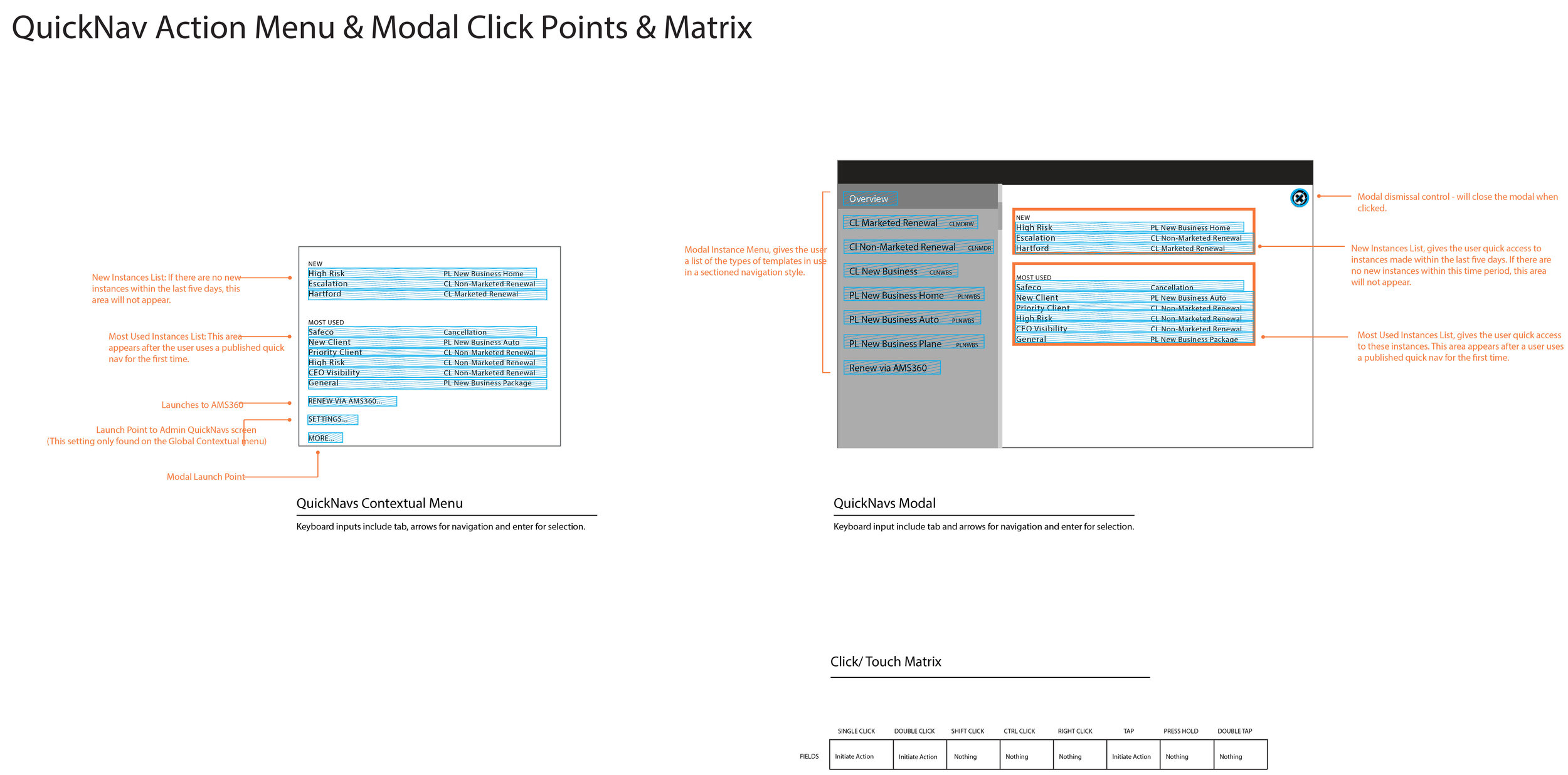
- CSR Quick Nav access point from the dashboard
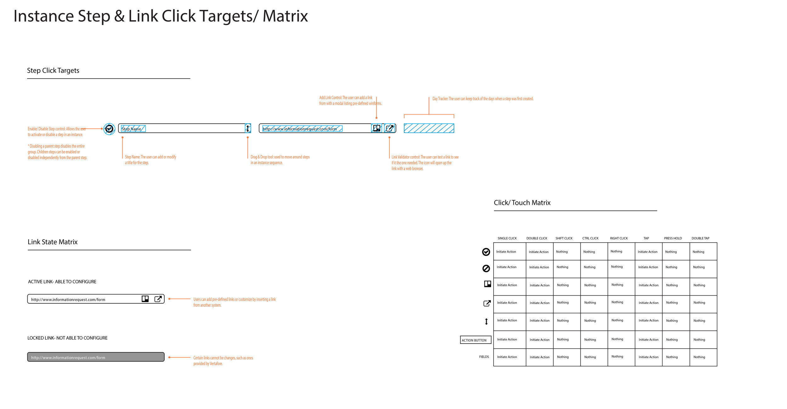
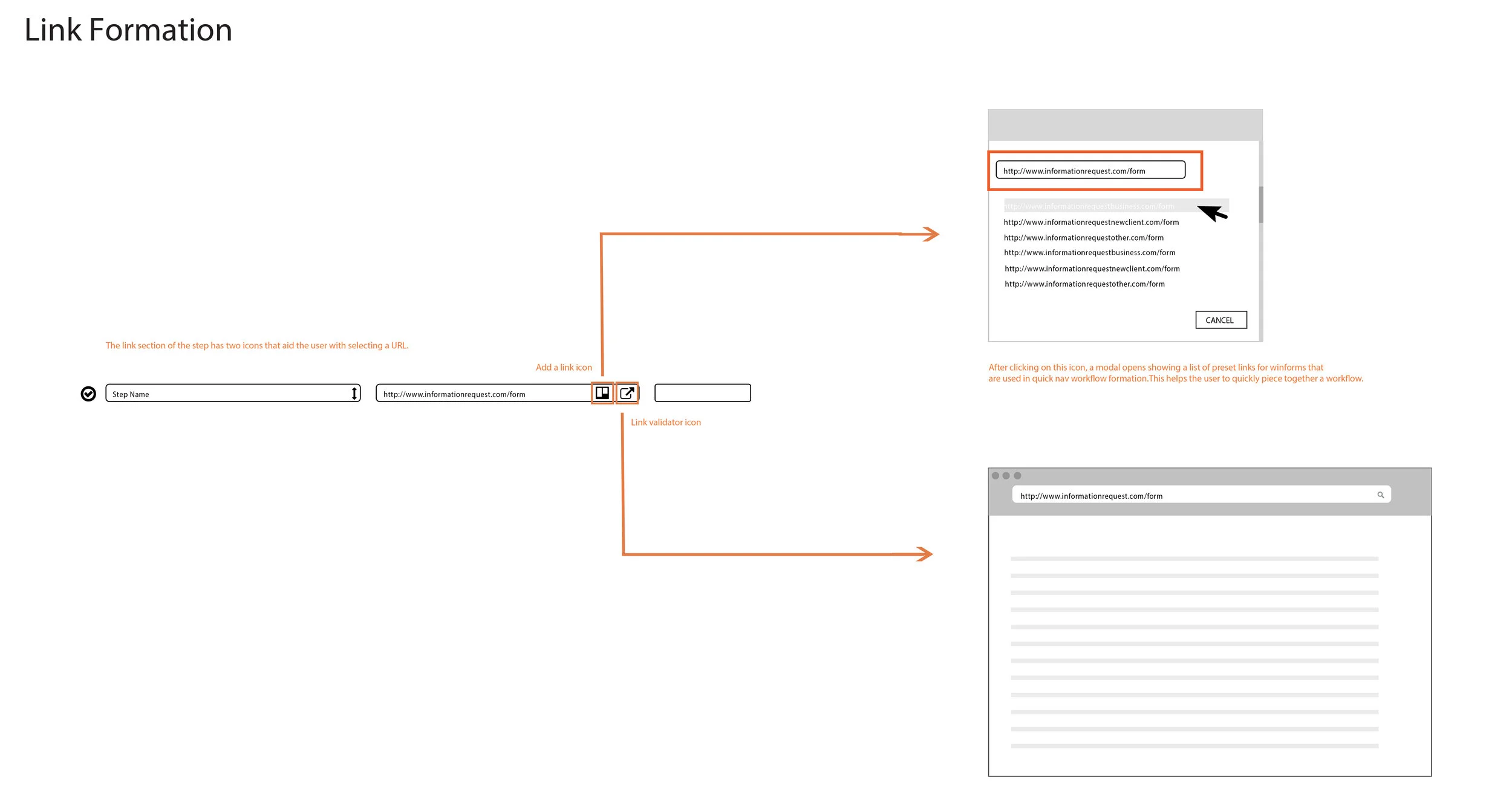
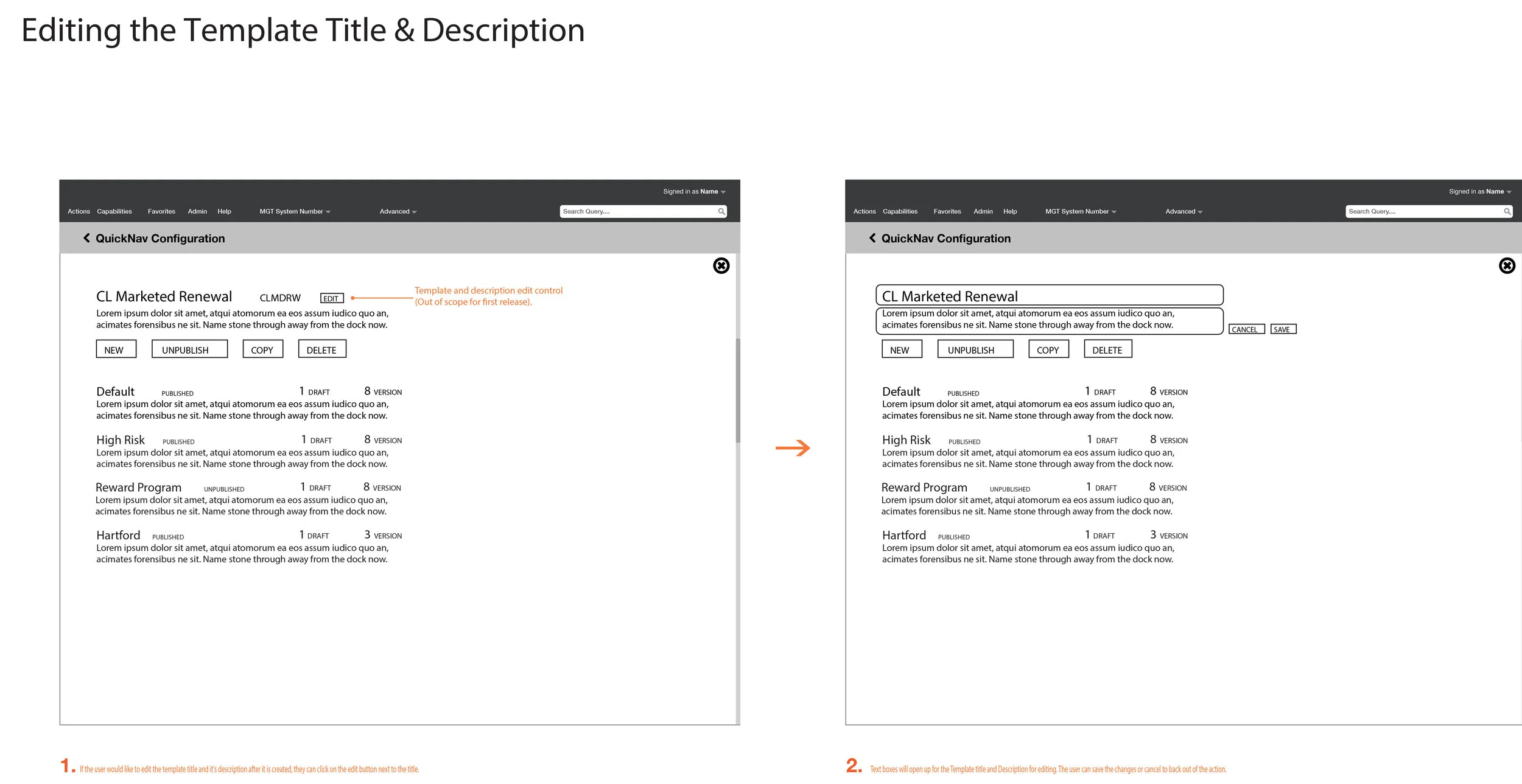
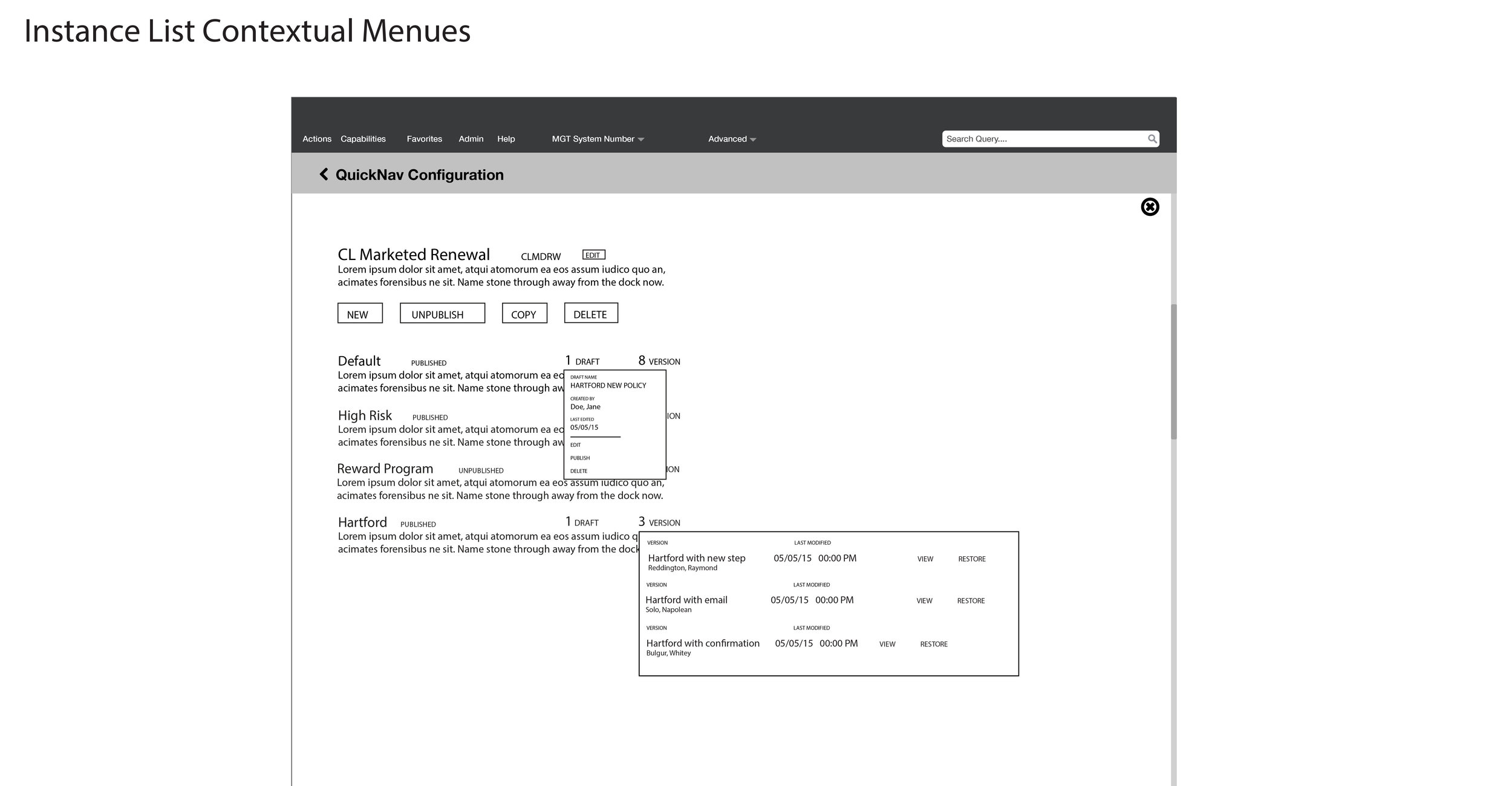
The testing went well; the users understood the new system! With the feedback validated, I moved on to creating interaction wireframes to chart out the new system and also the areas where the CSRs will interact with it. After I finished wireframes, another team mate worked on the visual design side for it.
- prototype & Test -
Since our design group understood the mental model behind the interaction side of the design, we ran another test to see if they understood the visual design side as well. The session resulted in some recommendations:
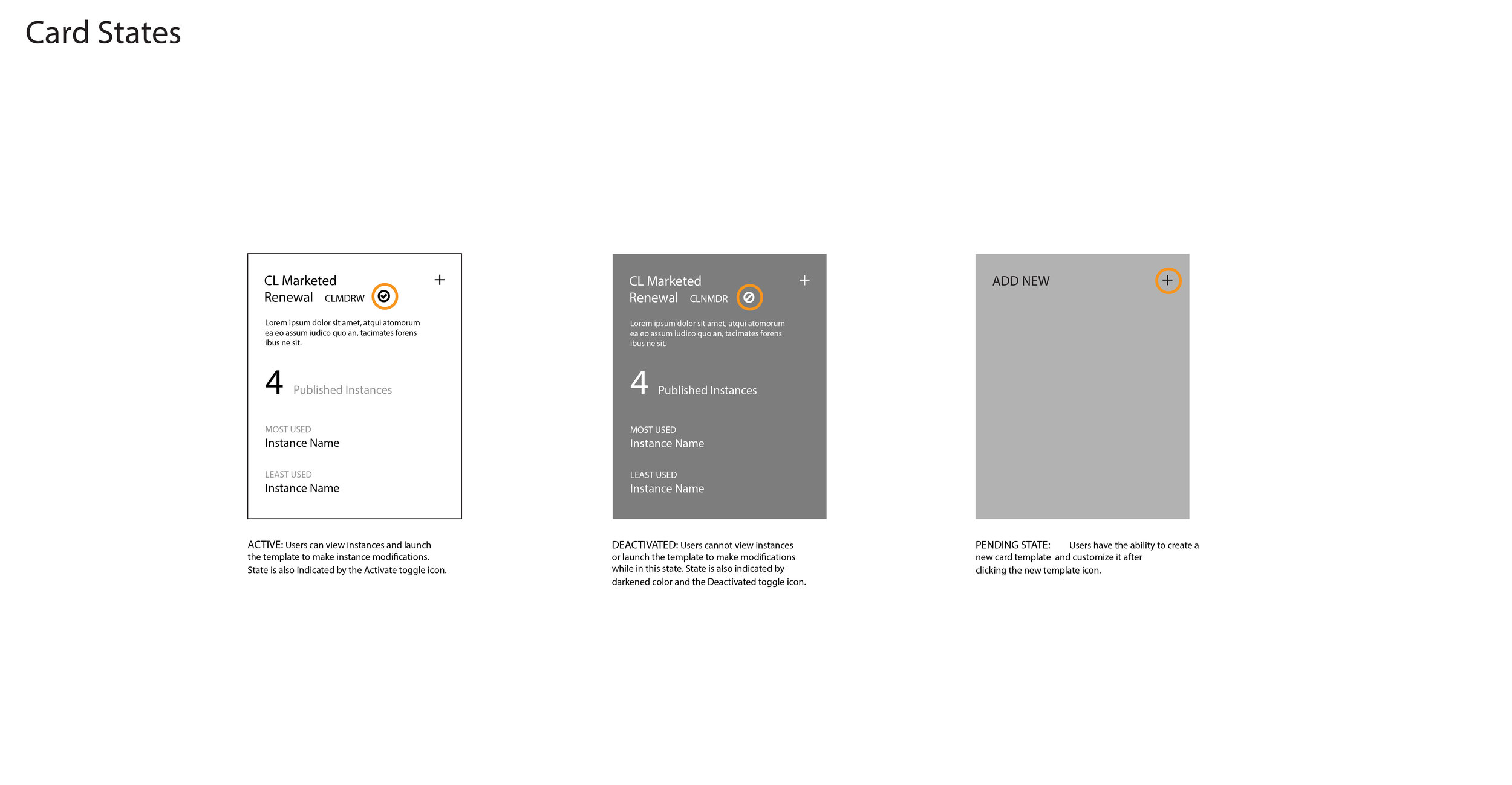
- Users were having problems differentiating between an active and disabled template.
- The template cards had a lot of space since we would not be posting a description on the first release, it bothered users.
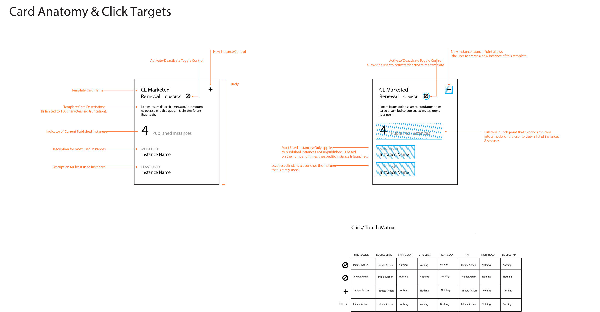
- The click target to take users to the card instance was the "interactions" number. They kept thinking it was the click target for that interaction.
Iterations
From the visual test, we made some changes:
- We used a toggle switch to show when a template was disabled to active.
- We shortened the card length for the first release; it will expand on the second release when the description is added.
- The click target for the interaction to take the user to the card's instance page was changed to the card title.
Final Visual Design
Final UX Wireframes
