I like comics website
- Approach & Process -
- Empathize -
To get an idea on the pain points of the current website, I interviewed six classmates, (a mixed group of men and women). The feedback was unanimous by all:
- The background was too dark and distracting with the olive green/black gradient background.
- They could not find the information they were interested in half of the time.
- The website had technical problems with numerous broken links.
Since the feedback was universal, designing for the two target audiences may be easier since they are identifying the same problem areas.
- Define -
Challenges: What types of information are customers looking for on the site and in which way should it be organized so it makes sense? What can we do on the visual side to bring in a secondary audience of women 15 - 25 years old?
Goals: Create an inviting interface that will visually appeal to both target audiences along with a strong information architecture that will allow customers to easily navigate and locate needed information.
- Ideate -
Hypothesis
For the visual problem, creating a site using a lighter background, desaturated primary swatches and refined typography to create a more modern and clean look might work to attract both audiences. For the information architecture problem, a closed card sort could be run to get some ideas for organization.
Competitor analysis
I set out on several tasks before I designed the user interface for the website. I researched local competitor websites around the area and ran an analysis on my observations. The competitors included Future Dreams, Excalibur Comics, Things from Another World (TFAW), Bridge City and Bingo Used Books. I put together a matrix on important areas related to marketing commerce, layout, browsing and navigation, terminology and labeling. My findings revealed that the competitors rated decent to mid-level scores. The large majority of them visually; however, were overflowing with information and extremely busy.
Card Sort
To address the organization issue for the I Like Comics website, I spoke with the owners on which information they wanted to include and created groups and tasks on sticky notes. I then ran a small focus group where I interviewed five men and five women from the nearby community college (my fellow classmates at Clark College), and ran a quick closed card sort. From the results, I was able to get an idea on how to organize the information structure.
Mood Board
I ran some ideas for colors, typography, textures and moods to try and fit both audiences.
- Prototype & Testing -
A/B Test
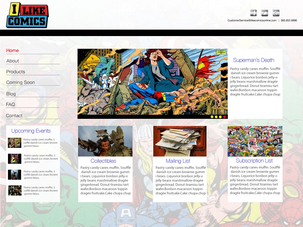
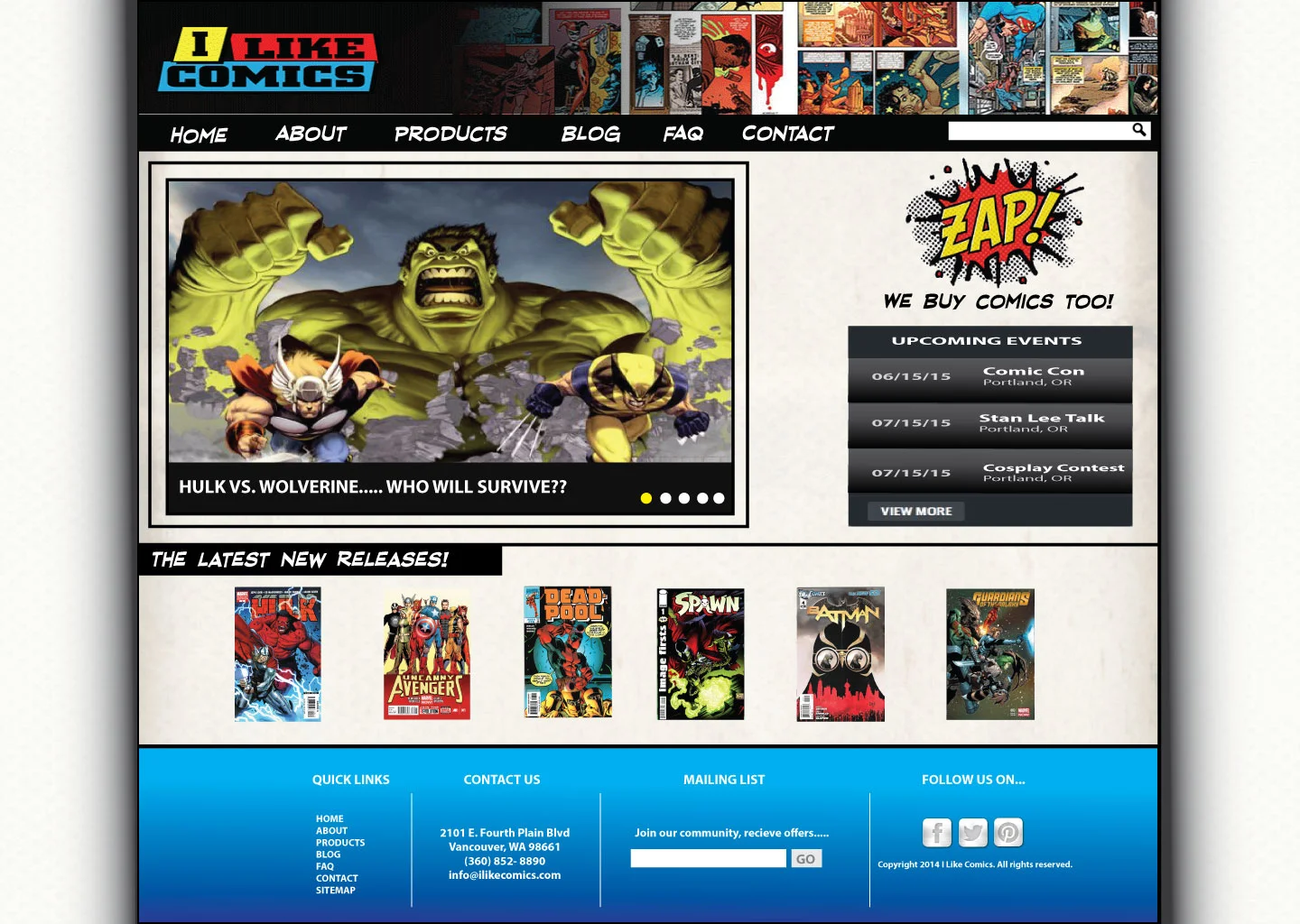
For this test, I interviewed six classmates (half of them men, the other half women) showing the two test versions. What I learned from the feedback was that four out of the six participants favored Version B because:
- "It feels more like a comic book website. The other version looks like it is selling a more upscale product."
- "Version B is more playful, and visually engaging".
- "Version A looks too washed out".
Visual Mock Ups
I created most of the primary navigation pages; the product manager picked up on designing the product and blog pages. The Policy page is legal disclosure that was needed for the store, it does not show up in the navigation, but it does on the site map.
Final Product
"I highly recommend Da Vinci Digital Design. They provided a really creative design for my site and customized it so it has a unique look that sets it apart from my competition. They have very fast turnaround and had my site up and running in no time. Oh, and by the way... our customer link to the new comic turned out GREAT!" - The owners, Chris & Amy Simons & Jerry
The website address is: http://ilikecomicsonline.com/


