Holoshopper
- Approach & Process -
- Empathize -
Persona
Currently, 90% of shopping still happens in brick and mortar stores, the other 10% happens online. The problems with shopping in a physical store for the customer are numerous: traffic, time consuming, lines and poor customer service. If a customer shops online, it is more convenient where it can be done on their time without leaving the house; however, they do not always know if what they are being shown is what they will receive in the mail.
A couple of other reasons why we think this product will be successful:
- There are currently 1 million headset owners in the United States today and rising.
- There is an unsaturated App market; there are only 300 virtual reality apps in the app store and they are primary geared towards entertainment.
- To make this business financially feasible, we will use and affiliate commission for revenue functioning as a sort of Amazon.com: we will make 10%- 18% of all goods purchased while the cookie is still active on the site.
- Define -
Challenges: How to design graphics and interactions in a virtual space that is different from a 2D environment? How will we enable users to move in this environment?
Goals: Create a shopping experience in virtual reality where the user can "see" and "feel" the product from the comfort of their own home.
- Ideate -
Concepts
There was debate among the team members on how the business should start out showing the product:
Should we start with a 3D system or mixture of both 2D and 3D views of the product?
The team decided, due to the technical effort to scan in items, it would be easier if the business started out with a mixture of 2D and 3D products. Another team mate and I brainstormed on how this new structure would look. For both views, it would need to be simple, easily selectable and not so information dense. We thought about going in the direction of a user interface card structure to solve this problem. Card elements only contain the most important, high level data on a single topic and it would perfectly be modified to be used for products. We took inspiration from other companies that utilize a card layout system like Pinterest and Netflix.
We had another essential problem to solve in this space:
How will people navigate and select in this space?
For available default controls, the Samsung Gear VR device has a four direction touch pad on the right side that allows for navigation and selection with a central button. For navigation, we choose head movements and for selection we used a gaze initiated timer system. In the top right hand corner of each card, will be the "selection circle". If the user would like to select a product, they hold a "long stare" at the circle for 5 seconds and this will signal to the system this is the card they have chosen for more details.
Moodboard
Some ideas for color, typography and mood to design for the interface. I wanted it to have a light, airy feel to it. For the logo, I experimented with a flat pattern for a modern, universal look since we plan to expand out to a general audience past our initial persona.
- Prototype -
Visual design mockups
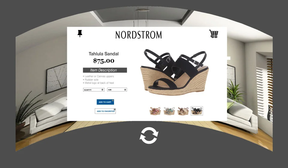
Based on the conceptual work, here is the visual design mocked up for the hack-a-thon along with the logo.
- Outcome & Takeaways -
The developer in our group learned Unity (a programming language for 3D programs). She was able to successfully create a space, but did not have time to apply any visual mock ups. (The unity test site can be viewed here: http://holoshopper.co/). Our group ended up placing third at the hack-a-thon competition! It was a fun project were I was able to explore how to design in a new virtual reality space. For next steps we are looking are preparing to launch the product soon with local retailers.


